
I do notice when people photograph things well though - just look at this blog. She was a regular poster to the dear departed Remnants but I don't see her around Rav so much now it's Remrants. I'm mentioning her because I remember she once wrote a few detailed posts about how to best show of your FO's and if you're interested you could have a little stalk but what I really want to talk to you about is how to make terrible photography look a bit better:
The answer is www.picmonkey.com.
Around this time last year I was frantically trying to get the patterns on the internet and we were using a website called Picnik which was fine if a little slow and we only really had access to very few bits and bobs. Then they sold out to google who decided to move it over to googleplus. We signed up to googleplus and I thought I was going to have to cope. I found a few other websites that might do just about what we wanted but I was sad that picnik was closing because as it was loading it told you a story about how it was 'spreading the blankets, buttering the bread, the ants were marching in, applying suncream' - cute!
Anyway, it was over, somehow I survived but one day I decided to have a quick google about picnik and low and behold it appears that some of the magicians who wrote that programme were working on a new website called Picmonkey. I was so excited I rushed there straight away and..... hated it... Somehow I couldn't work out how to even get a photo up to edit. I don't know what I was thinking about now, it's so easy!
Let me take you through a few steps that I use regularly:

This is the main screen. I've put an arrow pointing to 'edit a photo' (I swear it wasn't there when I first tried it!). All you have to do to edit a photo is either drag a file and drop it onto that square or click on the square and search for the file like you might do when you're normally opening a file.
I'm going to work on this photo :

When you've done that, it'll look something like this:

I was hoping that it would be on it's side as that's what it looks like in my files - but that's life. If you have to rotate something, click on the rotate symbol on the left hand side and it'll look something like this:

And then you can mess around either rotating by 90 degrees using the swirly arrows, or flipping using the double ended arrows or rotating by tiny increments using the slide-y bit at the bottom. Make sure you click on 'apply' before you move onto something else (but because picmonkey is made for normal people, it will ask you if you really want to move on so quickly if you haven't).
The next bit that I use the most is the 'exposure' button just underneath there. When you click on there it looks like this:

And, (here's where you know this is an idiot's guide written by an idiot), you mess around with these slide-y bits. The 'brightness' bit is often useful for me, my photos tend to be a bit dark because I don't know how to place lights/place things under lights to get the best effect - sometimes it just works and often it doesn't but the 'brightness' bit is always useful. Here's what my photo looks like now:

It's got to be better - now you can actually see things! Looks a bit chalky though - know what I mean?
So, I pop down to the 'colour' tab and crank up the saturation and temperature, so it looks something like this:

I'm worried now that I've gone too far the other way. So I'll pop back over to the crank the exposure down a few notches but since it's been bright enough for me to notice things, I can see that at the bottom right, my finger got involved somehow... So before I do anything else I'll click on the 'crop' button and it'll look something like this:

All you need to do then is drag those little dark grey splodges at the corner of your picture out to where you want them to be. The bit inside the highlighted box is what will stay when you click on apply at the left side. My only tip here is the rule of thirds. Apparently, if you split your photo roughly into thirds then you're onto a winner. With this one, for example, I'll keep the grass roughly to a third and the sky roughly to two thirds, like this...

Finger gone!
And then I went back to 'exposure' and twiddled downwards on the brightness slider and I came out with this:

Which I all of a sudden like a lot more because the clouds are back!
All the we've used here are the free functions. For now, there are other functions that are free too but I think that's just whilst they're testing them so at some point you can either pay for the extras or stick with the free bits.
All of this can happen in a matter of seconds if you're used to using it. Dead good.
And now I just want to show you the other part of picmonkey which I haven't messed around with much yet (I think it's newer) but I am loving. The collage section! Go back to the main screen and click here:

Once you've clicked on that, it looks like this:
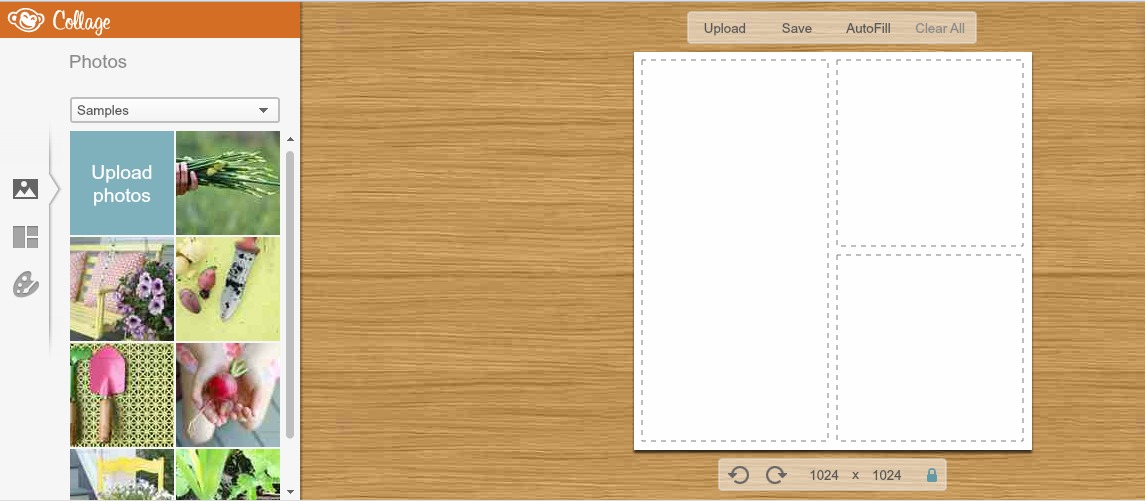
And from here you can either click on the upload photo button or the 'tiles' button:

Where the orange arrow is to change the formation of the tiles or the purple arrow to upload photos from your files. I tend to do the uploading first because then I know how many tiles I've got to use.
Once you've chosen you tile formation and and uploaded all of your photos, it's just a case of dragging each photo into each tile one by one. The nice thing about this is that as you use each photo, they put a little tick on the photo which is something that's so useful but I've never known it done before. Brilliant. Anyway, I've put the photos that I've done today all together in a collage here:

and just so you can see how bloody brilliant it is here's the first version with the last version.

Good job!
Right, I'm off to do more editing for my blog post tomorrow. A good one!
Love Eleanor.
No comments:
Post a Comment